On Lollipop Charts
and why I don’t recommend them for beginners
In Chart Chat Jeff and Steve discussed Lollipop Charts, discussing Cleveland and McGill’s research and how they felt it helped make the case for Dot Plots (vs Stephen Few’s disagreement).
The debate was interesting and their point well made but for me still missed the nuance of the debate.
Let’s take a step back first though and consider bar charts, the main alternative to lollipops. There are generally two types of bar chart:
We could perhaps offer a third type with both labels and an axis. That’s about the whole choice a designer has to make when considering this simple chart type. Neither are difficult to understand and both can be used to communicate a wide range of both use-cases, providing accuracy where needed.
Let’s now consider the Lollipop Chart.
Where, for me, the debate on these charts comes from is the fact the lollipop offers a lot more design choices for the chart maker.
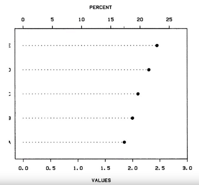
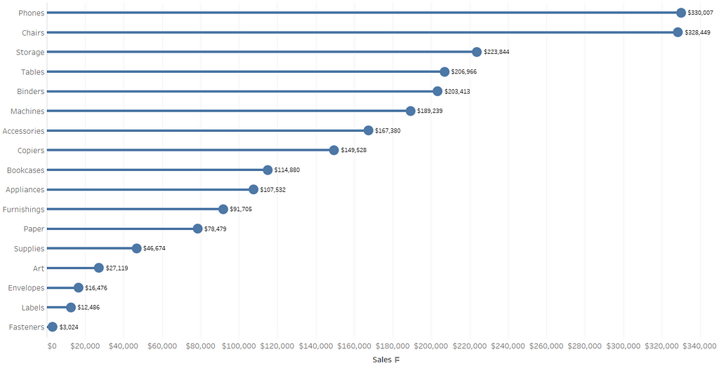
Few’s article and objections shows large dots with an axis (as per the last image above), Cleveland uses smaller dots. The former offers little more than a rough view of the data, the latter being much more accurate and generally more useful as a data visualisation.
We can debate the need for accuracy, especially with labels but for me the simple matter is that a lollipop chart offers a beginner a lot of design considerations (and ways to get it wrong), much more so than a bar chart. This, and this alone, is the reason I generally refrain from recommending lollipop charts to beginners.
I don’t debate in the right use cases they are useful and engaging, and just as accurate as bar charts. There is just more effort and thought required to get there.
Edit and addition:
In retrospect let me add a little more detail. Generally I don’t recommend them when there isn’t the time to go into the details and thoughts on the design. It isn’t good enough to flash up a lollipop chart as an example and finish there. However if there is time in the session then using the lollipop as an example of why design and thought process in visualisation is essential is very worthwhile.
In general I’ve seen enough bad lollipops to form the opinion that if you’re going to recommend lollipops to beginner’s you need time to explain why they work well and when they don’t. We don’t need that time with bar charts.


